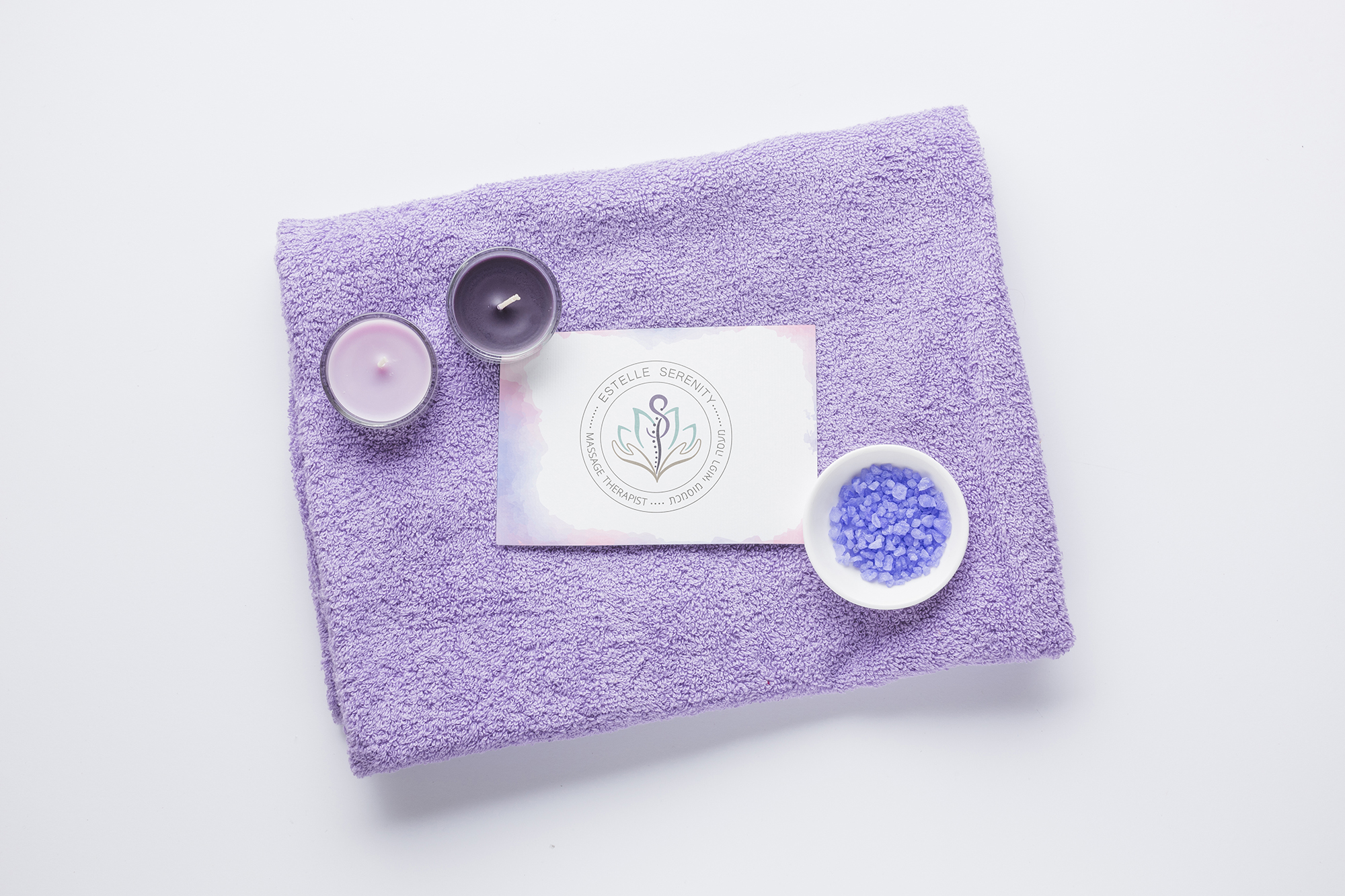
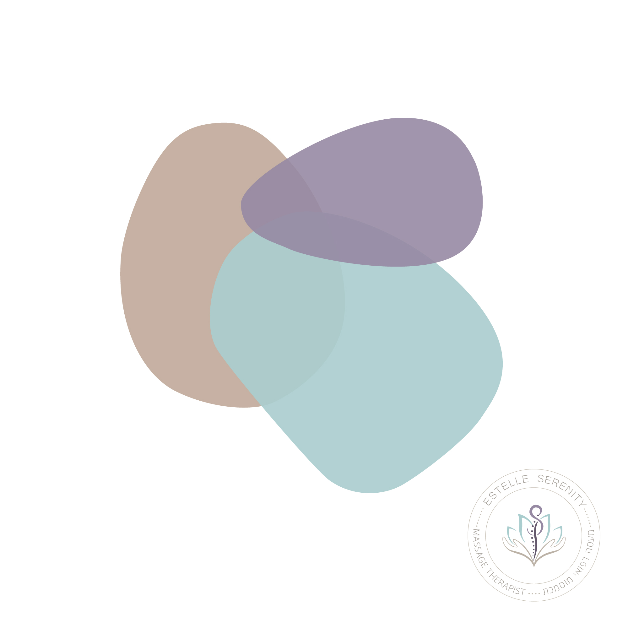
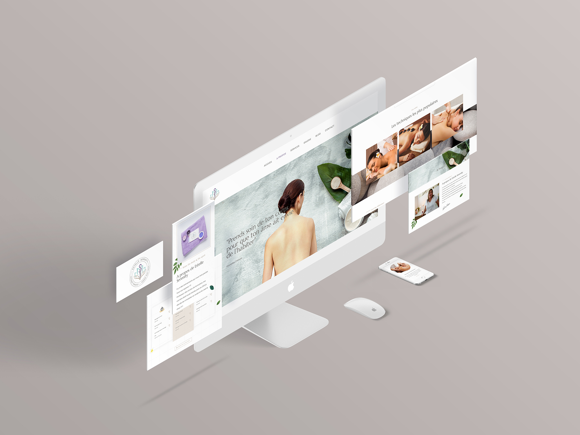
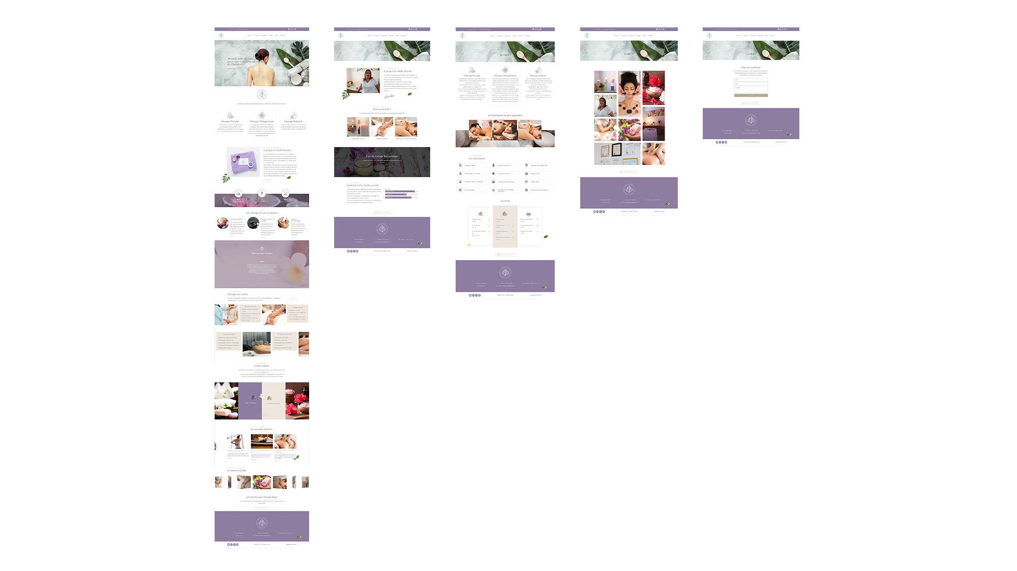
Estelle provides massage therapy services and body treatments. The global identity had to communicate cleanliness, relaxation, serenity and a medical approach. The logo was first hand drawn to have a natural and smooth curves, then I worked on the vectorial file to sublime the original sketch. The brand icon is a combinaison of the initial letter S of serenity, the hand of the therapist Estelle, the acupuncture spine points for the medical aspect, and the lotus flower for the relaxation. For the website, it was important to work on a wellness-focused experience for the users. We used branded elements and selected color palette to reflect the expectation of a relaxing, rejuvenating experience, with professional and medical treatments.