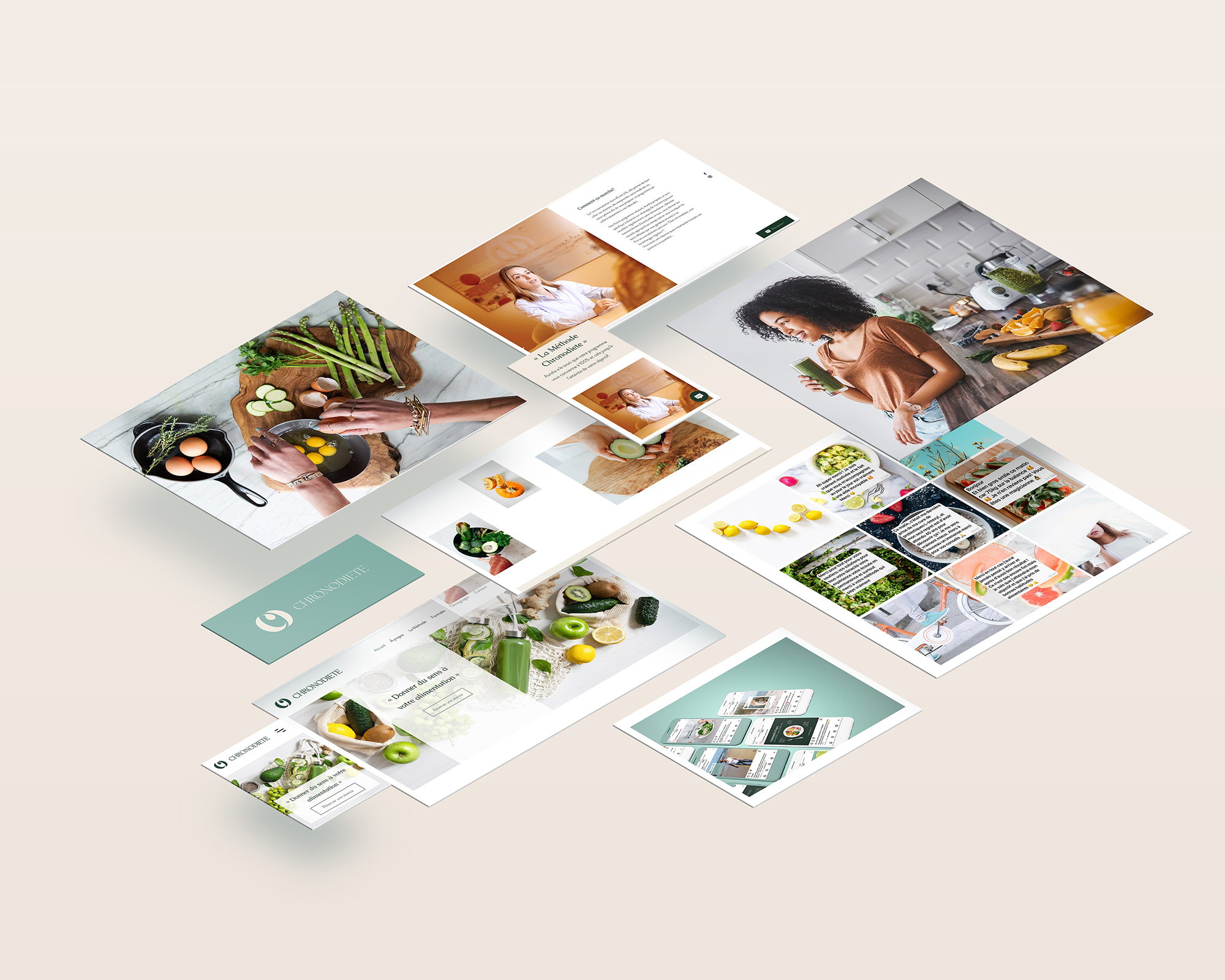
Chronodiete helps people build healthy relationship with food, educate about healthy eating, and help daily with personal menus and recipes. Chronodiete needed a branding makeover. The original logo, and the website as well, were outdated and didn’t reflect the values and personality of the brand. The new global identity has to fit the vision of the nutrition coach, with a bold icon and selected and smooth colors. It was important that the logo looks professional, elegant and original. The logo has been created to reflects Chronodiete personality using initials. The curves of the letters remember the diet process, with generous curves that become thinner. The character, color and smoothness of the letters are associated with naturalness, freshness, feminine elegance, lightness and purity.
Scope of work
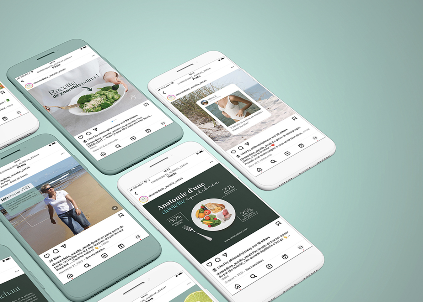
Logotype & Branding Website Design Digital Visuals